Skeleton screen, used for each front end. It not only enhances the user experience, it's simple to produce, it's good for data (fp, first rendering), it's basically brainless。
Much of the exploration of the skeleton screen now lies in how tools can be used to rapidly generate the skeleton screen, although this water-lined skeleton screen, if not the tools, will not take much time to develop. On the contrary, people are less concerned about what the skeleton screen should look like, what is its bottom logic and what is a good skeleton screen
This paper explores the idea behind the skeleton and how to make a better skeleton screen by looking back at the previous life of the skeleton screen and taking into account the true case of the salad。
Breaking the silence
The absence of feedback from the interface would upset users, a problem that has existed since the human machine was interactive. This is what we call the "white screen" problem in today's mobile internet scene. So, since time immemorial, there have been little animations to break the awkwardness of "infinite scrolls" and "turning circles" that you know:


Early cargo salad:
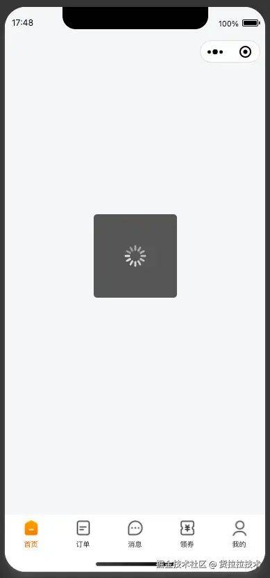
On the one hand, the user was told that "i'm still working, i'm not down" and, on the other hand, it attracted the user's attention, making the waiting time less boring。
Bones are born
But for a long time, you are not satisfied with these little animations, which do not reflect actual loading progress, nor do they have anything to do with what follows, and which, if they stay too long, make users more tired and feel slower. With the advent of the mobile internet age, the experience has become more and more valued, and a better "bonescreen" has been invented。
According to the information currently available, the first article describing the skeleton screen appeared in 2013: lukew |mobile designers: avoid the spinner

By definition, while data and resources are still being loaded, display a page of the "bone skeleton" so that users know what the next page looks like, and then fill it gradually. In general, the application is time-consuming to load data and resources, but the frame structure of the page can be predefined, so that this part of the information can be communicated to the user as soon as possible through the skeleton screen, so that the user can feel the progress of the page, with the expectation that the "page will soon be ready" (why do i think of a pdd cut again), while also making the whole loading process more consistent and less abrupt。
In summary, the advantage of the skeleton screen is:
A rough skeleton screen
By virtue of its unique advantages, the skeleton screen quickly became popular and gave rise to seemingly rich ecology。
Some of the ui libraries provided ready-made skeleton screen components and achieved "feasibility"。
It was felt that the assembly library was still too cumbersome, and an automated tool was developed to automatically generate a skeleton screen matching the existing page。
These tumultuous "ecological"s attract the attention of most people so that when talking about the skeleton screen, everyone is putting a skeleton screen on the application as quickly as possible。
Case 1:
The application of the original loading process was:
Blank - > circle - > content
The boss proposed to optimise it with a skeleton screen, and the development of ui modules was done quickly, so the loading process became:
Bones screen - content
Boss: why the circle
Develop: tell me if i'm doing it fast
Boss: can you turn the circle into a skeleton screen
Develop: this skeleton screen is a fact component, you know? React before you see it, before you go in circles...
Boss: i don't know what's going on, but i know a little bit
Development: time to go...
See, tools are used, and they are limited. One of the meaning of the skeleton screen is that it "results the user as quickly as possible" and that it is good to put it directly in the original HTML template. But the proliferation of tools has made people lazy and turned into "the fastest way to meet the needs of the boss"。
Case 2:
A small program development tool has also been designed to create an automatic skeleton screen:
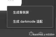
The creation of a skeleton screen is similar:

It's working. Okay. It's okay. We make changes based on the code that it generates
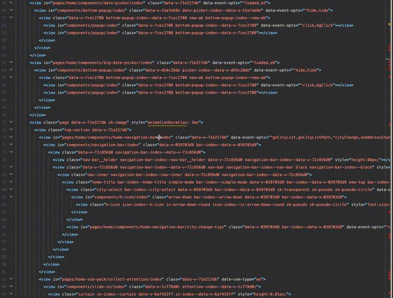
Well..
This is compounded by the fact that the size of the small program is already capped。
I don't know.
Finally, we've got a nice skeleton screen and put it on
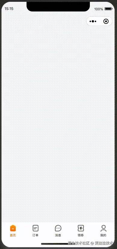
It's a little bumpy, and it seems to be waiting longer
The previous interface, which had returned the corresponding module first, was a little messy, but it was gradual and allowed to see something first. It's a so-called "bonescreen" that's going to have to wait until the slowest interface returns before all of it appears。
It's not a skeleton screen, it's a splash screen, it's a circle that doesn't at least block the entire page。
It was intended that it would be more cumbersome and less effective。
Good skeleton screen
"what's available is only bad for you," "brainless" makes people lose their minds and ignores the idea of a skeleton。
Looking back at the core idea of the lower skeleton: timely feedback, coherence, let us start with a truly effective skeleton screen。
Change in finer particle size
It's possible that the "screen" of the skeleton screen is misleading and leads people to think it must have covered the entire screen. In fact, it's more important to focus on the "bonescreature," which means that the whole loading process is a process of filling first with a skeleton and then gradually。
As indicated below (with a view to demonstrating the effects, the rate was deliberately slowed down):

As can be seen, we split a large skeleton "screen" into components, with individual modules independently controlling their own skeleton screens, making changes more smoother than the real-time loading of the original interface, giving rise to certain expectations, without a sense of surprise。
Colour skeleton screen
The skeleton screen is often designed to be light gray, as it is less visible and does not take too much attention from users, and it is not too abrupt to replace it with whatever content。
But if there is a more definite colour for the contents to be loaded, the skeleton screen can also be coloured. The following diagrams, including colours and some non-changeable text, can be part of the skeleton screen:
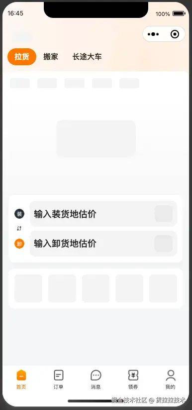
This reflects the "timely feedback" principle of the skeleton screen, which is given to users as soon as it is certain and ready。
Bones shield effect
Looking back at what was said earlier, "break the silence" would reduce the anxiety of users, and it would be better if the skeleton screen moved again。
For example, is it a little bit better than not moving
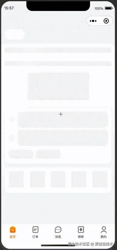
But this flashing light does not reflect consistency, but it is just a large, infinite progress strip or circle。
A better way to turn the loading of the skeleton screen itself into a consistent animation:
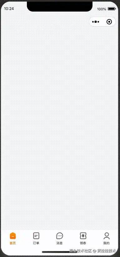
This skeleton screen has a gradual effect, and you may not realize that this animation takes 400 milliseconds, and users tend to ignore the time, not to call it white, because they see "progress" on the page, which is the benefit of fine particle size changes. It's the same thing that a well-functioning mobile system animation makes people feel more fluid。
The ultimate skeleton screen
So, our skeleton screen looks perfect, but it's not the best。
The skeleton screen itself is a state of transition designed to cover the load. And because the loading of a skeleton is itself very quick, it makes some performance indicators very good, such as the fp (first rendering), the fcp (first rendering). However, seeing the skeleton screen does not mean that the page is loaded, but rather that the loading is just beginning. Bones not only paralyse users, but also paralysing them, so that they ignore what really needs to be done: optimizing the speed of the interface response, optimizing the speed of resource loading, and optimizing the efficiency of programme operation. These tangible optimizations will make the display of the skeletons shorter。
So it's not all good that you put on the skeleton screen, the ultimate goal of which should be "to make it disappear."。
Can it really happen? After all, there are objective and uncontrollable factors, such as networks, customer performance, and it is unrealistic to make the skeleton screen really disappear. Is there any way to make the user feel the skeleton screen has disappeared
One case: