Terms for plane design
The design of the plane is a pattern that combines different basic graphics on the plane according to certain rules. The following are the terms used in the graphic design of the compendium, which will be used as a reference, in the hope of helping friends in need。
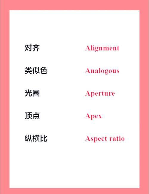
Harmony:
In a narrow sense, it is not tedious or obscurantistic to understand that a harmonious plane design is one and the other. It is understood in broad terms that in judging the relationship between two or more elements, or between parts and parts, each part gives us a sense of feeling and consciousness that is a coherent whole。
2. Comparison:
By contrast, the successful combination of two elements, either qualitative or quantitative, gives a sense of clarity and unity, making the subject more visible and dynamic。
3. Symmetry:
Assuming that a vertical line is set in the centre of a graphic that divides the graphic into equal parts of the left and the right and the left, the graphic is identical, which is symmetrical。
Balance:
Physically understood means the weight relationship, which in the design of the plane means the balance between the distribution of the image in terms of size, size, weight, colour and material and visual judgement。
5. Proportion:
Is the quantitative relationship between part and part or part and whole. The ratio is an important factor in all unit sizes in the design, as well as in the grouping between units。
6. Focus:
The centrepiece of the picture is the focus of the vision, the change in the contours of the image, the fragmentation of the graphics, the colours or the dark distributions that influence the visual centre。
7. Rhythm:
The rhythm, which has a sense of time, is used to create a sense of motion when it is designed to indicate a continuous repetition of the same element。
The rhythm:
The simple grouping of units in the plane composition is easily monotonous, organized in numerical and symmetrical order by a regularly changing image or group of colours, resulting in a musical melody that becomes the rhythm。
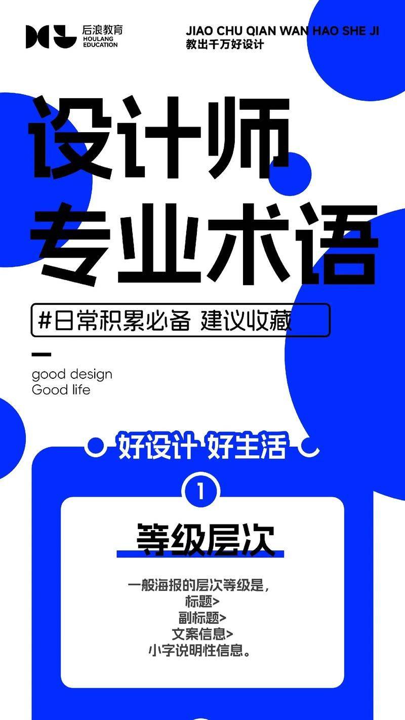
General knowledge of graphic design
[i] contrast of size
The relationship between size and size is one of the most important building blocks that can almost determine the relationship between the image and reconciliation. Fewer differences in size, milder feelings, larger differences in size, sharper feelings and strong feelings。
[ii] the dark contrast
The contrast between the sun and the sun, between the sun and vice, between the day and the night, etc., can make people feel the dark relationship in everyday life. Early babies can only be visually bright, while animals such as cattle and dogs can easily identify black and white, but not colour or colour, so it is clear that the bright and dark [black and white] are the most basic elements of colour。
[iii] crude comparison
The thicker the font, the more male. If it represents fashionable and female, it is usually written in fine print. If the volume increases, the boldness should be reduced, and the mix appears to be relatively straightforward。
[quadratic] and straight lines
The curve is very soft and mild; the straight line is strong and sharp and very macho. In nature, both are appropriately mixed. Usually we do not notice this relationship, but when curves or straight lines emphasize a shape, we are impressed, and at the same time have a corresponding emotion. That is why we are often trying to deepen the image of the curve by highlighting it with some straight lines, or, to say the least, by making the curve more visible。
Temporal comparison
In the everyday life of the general population, it may be rare to hear that word, but in the fine arts, it is an important shaping factor. Like laxity, lubrication, moisture, etc., all describe the quality. The sense of quality is not only expressed but also integrated with it。
We observe the artist's work and so on, and we often look at its colour and image composition. In fact, the quality is the main factor that determines the style of the work. Although the colour or object changes, the quality of the work that is based on it is closely related to the essence of a painter and is not easily changed. It is easy to ignore it if it is a layman, which, in fact, is the most important underlying factor and the strongest influence on emotion。
Comparison of position [vi]
The placement of an object on both sides of the picture can not only be highlighted but also contrasted. There are potential power points on the top and bottom of the picture, on the left and on the diagonal, where the power of hidden power can be shown by the configuration of photographs, large titles or signs, signs, etc. Thus, in the position of potential antagonism, the placement of distinct shape elements can show contrasts and generate a close sense of convergence。
[vii] the comparison between lord and lord
The layout is the same as the stage design, and the audience's mind will calm down when the relationship between the protagonist and the sidekick is clear. A clear indication of the master's approach is a orthodox method of composition, which creates a sense of comfort. If the relationship between the two is blurred, it would be incomprehensible. On the contrary, the protagonist loses his vigil and becomes a mediocre image。
The main character in the play, everyone can see it. It would make the reader more aware of the content if it also showed who was the main actor. So it's a basic condition for designing configurations。
[viii] comparison of movement and quiet
A story begins with a beginning, a description, a transformation and an outcome. In one courtyard, there is also collaboration with fake mountains, ponds, grass, waterfalls, etc. There is also a strong dynamic and quiet part of the design configuration。
The shape of proliferation or movement is "move". The horizontal or vertically reinforced shape is still. It's a "move" part of the area。
The "quiet" part is small and leaves a reasonable margin for highlighting its independence. This arrangement is typically designed to fit the focus of the picture. As a result, the "quiet" section, although small, has a strong presence。
[ix] multiple comparisons
There are also contrasts between curves and lines, vertical and horizontal, sharp and blunt. A combination of the above-mentioned comparisons and these elements would make it possible to produce a changeable picture。
♪ ten ♪
The space of the entire page is dynamic because of the forces, which in turn dominates the space. The shape that produces the dynamic and the other shape that accepts the dynamic are complementary and make space change more dynamic。
We're going to build a fake mountain garden with a strong focus on the export of running water, which is the starting point for moving water, and the entire garden will be affected by it. When it comes to the composition of the layout, the rationale is the same, and the starting point and the receiving point are responsive and coordinated. The greater the distance between the two, the greater the impact, and the two ends of the picture, the greater the balance between starting points and receiving points, the need for the right changes of power and power, and the resonance of one party if it is too weak。
Eleven to one
When it is reversed, the relationship between the map and the ground changes. Prints are generally printed in white paper, which is referred to as ground and black. On the contrary, it is sometimes written in reverse on black paper, where the black bottom is on the ground and the white is on the map, a phenomenon of black and white conversion。
[xii] balance
When walking to a rock, the body falls from a loss of balance, and naturally a hand or foot is reached quickly to maintain the body balance. According to this natural principle, if we change the location of all parts of a good original work and analyse it in comparison with the original work, it is easy to understand the principle of balance。
13 symmetry
From a point of view, the form that spreads simultaneously to the left and the left is called the right symmetry. Applying symmetric principles can develop complex situations such as vortex。
In everyday life, there are many common symmetrys, such as the configuration of buddha statues or the configuration of temples in the shrines. The symmetrical image of a high-profile, stylish image。
[xiv] emphasizing
The effect of the same tone, without prejudice to the tone, would be to add appropriate changes. The emphasis was on breaking the single tone of the page and making it airy, lively and dynamic. For example, the layouts are textual and appear to be odious, and if they are accompanied by illustrations or photographs, they are like a stone thrown into a calm water surface, creating a wave of tatters。
[fifteen]
Greek art is characterized by the gold ratio, which, when designed in terms of the size, width, height and shape of the column, can be handled by reference to the gold ratio, can produce greek-specific architectural styles, as well as a steady and moderate sense of tension. The ratio of length, width, area, etc. Can produce the same function as other shape-making factors and perform excellent images, and it is therefore important to use the appropriate ratio。
"sixteen."
The shape of a common impression, which is repeated, creates a rhythm. It doesn't have to be in the same shape. Just have a strong impression. Three times and four times, it's easy to feel the rhythm. Sometimes, it's only repeated in a characteristic shape that creates a rhythm。
Around the center of gravity
There's a subtle difference in human perception. Because there's a particularly attractive place in the lower right corner. How to deal with this place becomes a key issue when considering the balance。
Human vision is more natural for moving from top to bottom right. When text is organized, the lower right corner is left blank for headings and illustrations, which produces a very natural flow. If it is reversed, it would be out of balance and unorthodox. This sense of balance in the right and the left may have something to do with the right hand!
[xviii] heart and proliferation
In our emotions, we always know the central part of things. It's a little careless to look at things, but it's in our minds that we always want to look at the central part of it, and it's like that that that's what makes us feel safe, and that's what gives us vision. Generally speaking, heart-to-heart appearances of tenderness are also generally preferred, but easily common. Centrifugal layouts can be described as proliferation. Common examples of proliferation patterns with a modern sense of organization。
[xix] junp rate
The size of the title must be determined by the content in the layout. The ratio between the title and the size of the paper is called the jump rate. The higher the jump rate, the more lively the page; the smaller the jump rate, the higher the layout. By this measure, it is easy to judge the impact of the layout. Once the title and the font size of the paper are determined, it is also of considerable learning to consider the ratio relationship between the parties and how to adjust it further。
[xxi] unity and reconciliation
If too much emphasis is placed on comparative relationships, it is easy to confuse the picture when too many or too many shape elements are left in space. To reconcile this phenomenon, it would be preferable to include a number of cross-cutting building blocks, so that the picture produces a common tone and a sense of unity and harmony。
The repeated use of homogenesis creates a sense of harmony. When you put the same thing together, you get a sense of continuity. The synergies between the two can create a uniform and reconciled effect。