The scope of application of layout design covers the areas of graphic design such as newspapers, journals, books (pastbooks), product samples, calendars, displays, posters, e-labels, posters, album covers and web pages。
First, let's find out what a layout is
Layout design is an important component of modern design art and an important means of visual communication. On the face of it, it is a matter of organization. Indeed, it is not only a skill, but also a high degree of technological and artistic convergence, and layout design is one of the essential functions of modern designers。
Layout design is the designer, based on the design theme and visual needs, using the modeling elements and form principles within a limited pre-defined layout, to communicate visual messages such as text, pictures (graphs) and colours, according to the needs of the particular subject and content, and to conduct structured and purposeful combinations of design behaviours and processes。
Today, we highlight the many design techniques of the "photogram" in layout design。
Tiled pictures
Flattening of pictures: the image is used as the entire background in the layout, which is used mostly for the design of the written cover。
1. Attention
2. Case presentation
3. Layout structure analysis
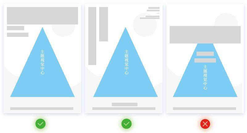
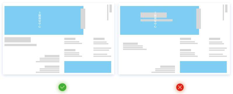
For a layout like this, the choice of the theme centre is the central location of the picture, so we have to select the blank area around the theme map for text organization, so that it does not affect the beauty of the picture and its recognition。
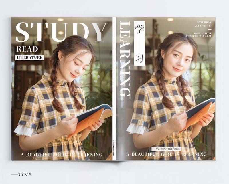
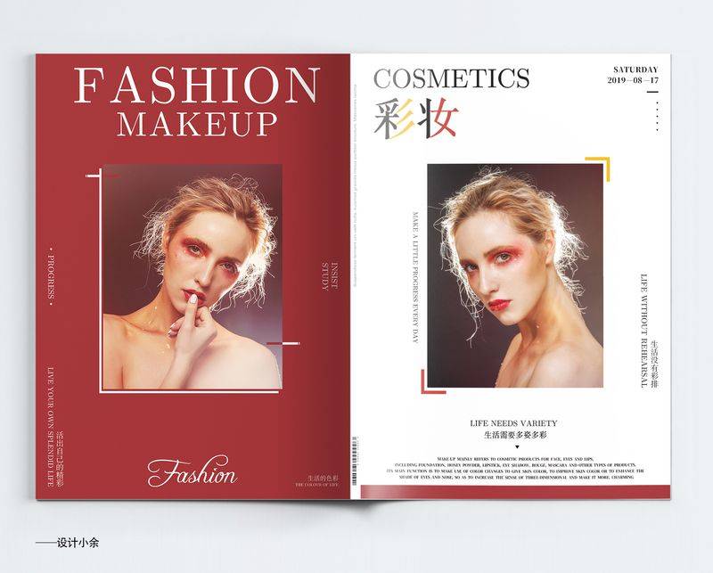
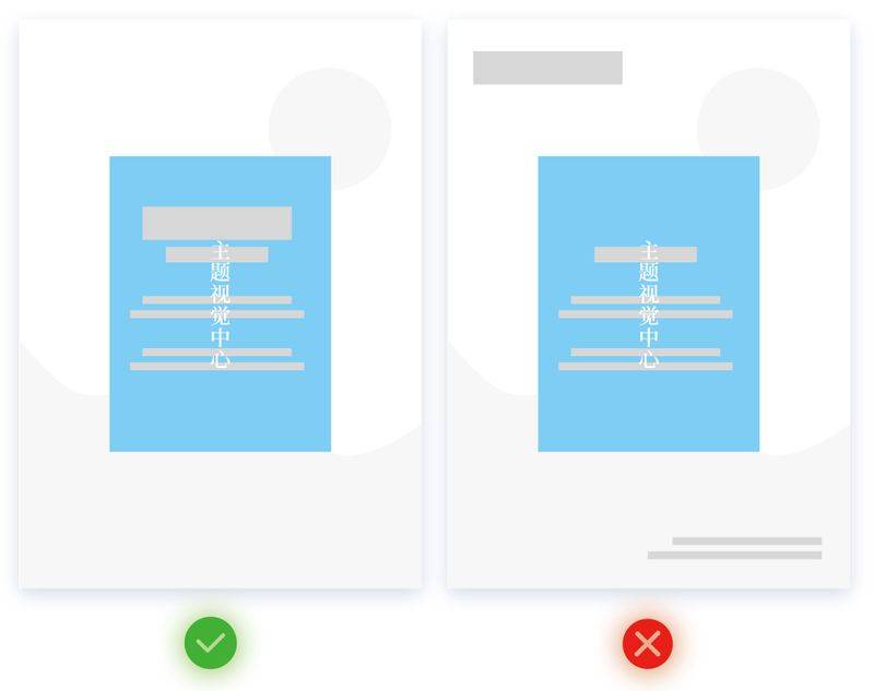
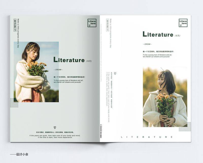
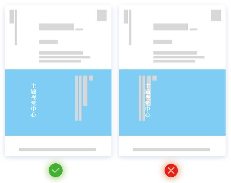
Centered picture
Pictures are in the middle of the layout: they are in the middle of the picture, and they are in the same space as the corresponding position around them。
1. Attention
2. Case presentation
3. Layout structure analysis
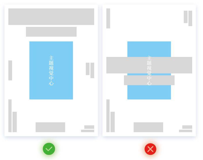
This layout can be seen as the centerpiece of the picture at first glance in the design of the case presentation, so we can choose to type the text in the blank area around the picture, because the white space is enough to set the text, and we would prefer to leave the text in the white area, so that the entire layout will not be unbalanced。
The text may also overlap with the picture as required by the design. Depending on the situation, most of them remain in the white areas。
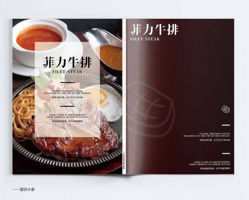
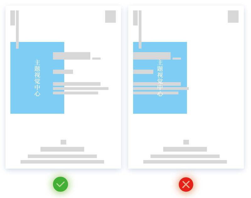
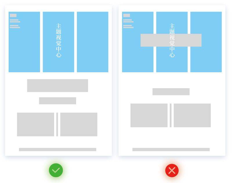
Picture tiled + color block + text
Picture tilt + colour + text: this refers to placing the picture on the board, either in the same whole or in the same way, and then adding a coloured piece to the picture and superimposeing the text on the colour。
1. Attention
2. Case presentation
3. Layout structure analysis
Although our visual centres are in the central area of the layout (i. E. The light blue rectangular area) and the second, the difference is that we have a full picture at the bottom, a rectangular layer of images and text that guides the view of users, with the aim of enabling users to see our subject text, so the text section here is the subject。
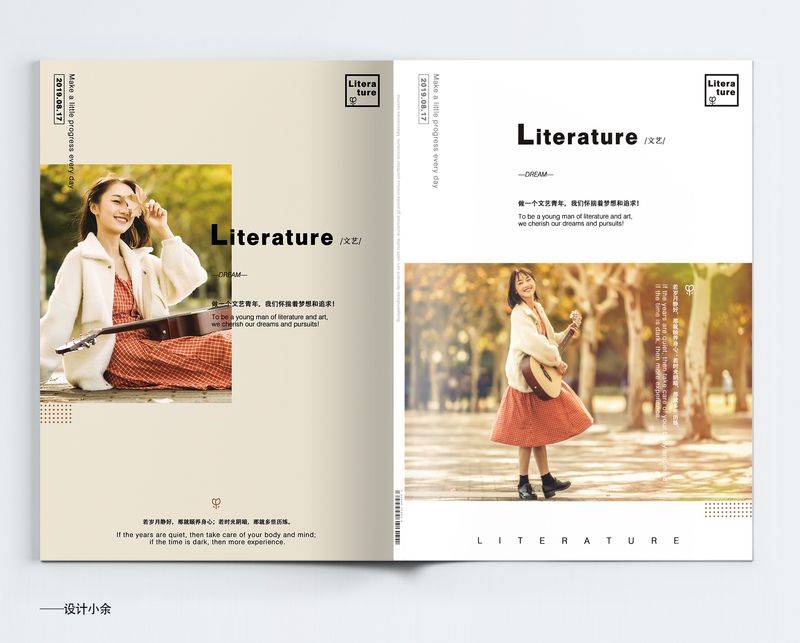
Picture any layout
Pictures are randomly formatted: they are placed in any location on the screen and not in the middle。
1. Attention
2. Case presentation
3. Layout structure analysis
I'm doing a layout analysis with only one type of layout, a type of layout that is typically the first view of the user, a combination of pictures and themes, and a relatively large number of white positions, so it's better if the layout of the script does not interfere with the image's effects, the proper use of the white position, and the beauty and identity of the picture, so that the entire page can be aesthetic。
Picture hemorrhage
Images of haemorrhage: the one-side, two-side, three-side hemorrhage can be the one-side, two-side, three-side hemorrhage that can be kept around the page。
1. Attention
2. Case presentation
3. Layout structure analysis
We can type the case on a picture, but we need to keep the theme of the picture depending on the location of the subject, without prejudice to the identity and aestheticity of the subject matter of the picture, and some associated case files in the off-focus area of the picture, so that it does not affect the picture or lead users to view the text。
Picture split layout
Images are divided into layouts: they are divided into several graphic combinations without affecting the integrity of the image identification。
1. Attention
2. Case presentation
3. Layout structure analysis
And here's the first case for a layout analysis, and each picture has a corresponding location at the centre of the picture's vision, so if we need to do some layouts on the picture, we need to be careful to do something that doesn't affect the main image。
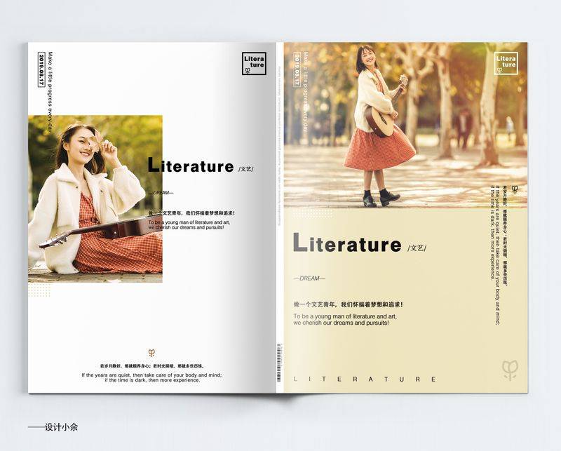
Picture over page layout
Pictures are all over the page layout: they're on two sides of the page, and they're all about size。
1. Attention
2. Case presentation
3. Layout structure analysis
There are also many ways of layouting across pages, which can be bleeding on several sides or in various parts of the layout, as well as the fact that the staggered layout of images and documents will make the entire layout more beautiful and breathing, and it is best not to have a pile of pictures on one side, but a layout of documents on the other。
Summary
In fact, for me personally, the layout, however typed, is the first one that attracts the attention of the user, so the selection of the picture must be focused on the subject, and the selection of a picture with a certain beauty and attraction. In order to attract the eyes of the users, there must be one advantage, whether it be pictures or text layouts。
The main features of today's presentation are the seven different types of layout that we've designed