A lot of students asked shih why other people put their fonts in such a way as to be spicy. It's like color, and there's a lot of learning. I'm sure you'll get a lot better after reading designschool。
The layout is one of the most important components of the design, and it's not just so simple to put beautiful fonts in a handsome background. However, the production of excellent layouts is not easy, with mined areas scattered and little attention being paid to mediocrity. Too much detail tends to ignore the design of the whole, too much emphasis on the visual, too easily to ignore the functionality, and too many daily errors are inconceivable. So today, we summarize the 20 error areas that are common in layout design, so we're going to help you comb through the easy-to-eat layout problems in day-to-day design。
It must have been colored. Don't miss the designer's color theory: do you really understand color
Overcrowded text: word spacing
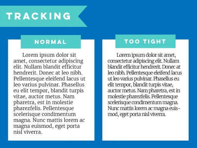
This is an error that can easily be ignored, and overcrowding reduces the readability of text. Some of the fonts are thinner or too tight to be properly adapted to readable status。
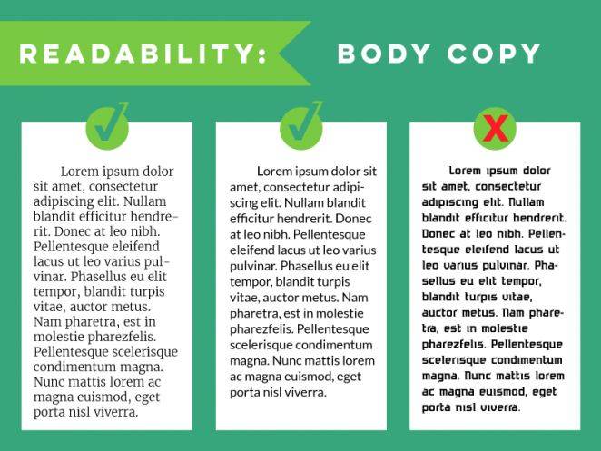
Intensive paragraphs: line spacing
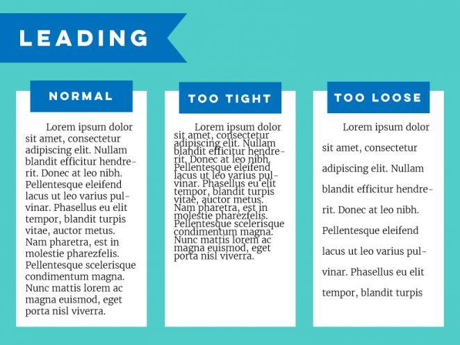
Spacing is also an important factor affecting readability, and too tight can be difficult to identify, but it is not reasonable to stretch space in a single way. The normal line spacing is about 50 per cent of the line height。
3. Unreasonable stretching and compression
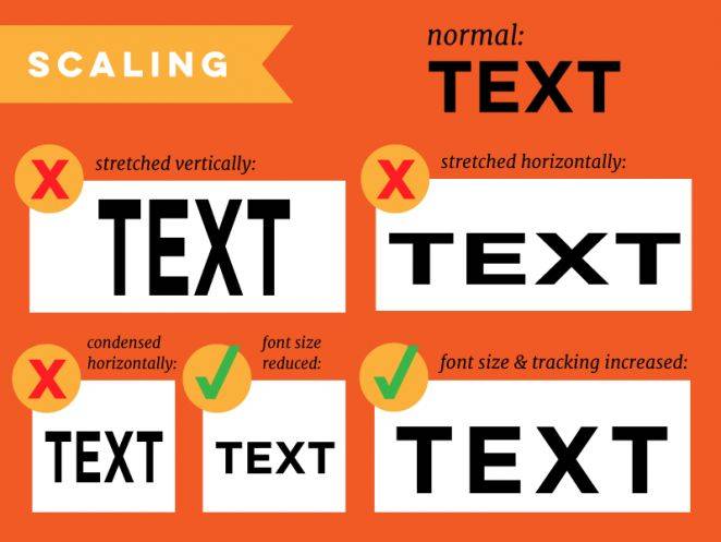
This is another common error where elements such as pictures, text, etc. Do not stretch or compress at the original scale to cause abnormal distortions and shapes。
To avoid this problem, it is not difficult to control changes in individual elements, such as long or wide, as much as possible while keeping the ratio, in software such as ps or ai, holding down shift buttons, and setting elements or controlling individual variables as much as possible in the original scale when web page design。
4. Ignore readability
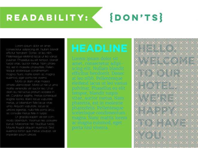
As noted above, there are many factors influencing readability, but among the many problems, the basis for ensuring readability is readability — at least to make the element itself visible. The use of white fonts in the black background generally ensures readability, and the comparison is clear, but if the fonts are too thin, visual recognition is low. Very small fonts, insufficient colour contrasts and high transparency create similar problems, as long as you find them difficult to identify and target。
5. Read comfort of text
The designer's layout design requirements cannot, of course, be limited to the extent that they can be seen. Titles, posters use thicker, fancy, decorative fonts that function, but the body parts of the long text require long reading by the user to maintain the ease of reading. Font size, word spacing and line spacing require careful handling. In the traditional layout design, this section is more inclined to use liners, such as the boyazzon used in chinese newspapers, which is a specially designed set of fonts, liners, well-articulated pens, and high-profile. However, with the change in design style and demand, the current use of non-linear bodies and the need to take into account the experience of reading on different devices, the platinum and mind-brushes are available。
6. “older” and “widow”
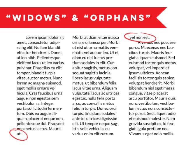
The terms “orphans” and “widows” are in print layouts, usually referring to short lines consisting of a line, a page header and a footer at the end of a paragraph consisting of only one or two words. These lines or columns are very nuanced in the design project where text layout is the main subject, and if you do not want to interrupt the continuity of the layout with large pieces of white space, the best solution is to fine-tune the width and spacing of the paragraphs。
7. Do not double-click spaces at the end of the sentence
This type of input habits are not uncommon in chinese, but in english-speaking countries many people will have similar habits, double-clicking spaces after the end of a sentence means the end, but in today's layout habits it is generally considered obsolete and unnecessary. This distance affects the flow of reading visually and the layout. Be patient。
8. Use too many fonts
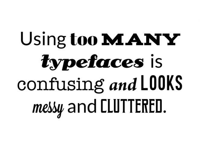
It's the most common mistake of beginners. The use of multiple fonts is intended for decorative purposes, but is poor control and prone to visual interference, and it is reasonable to keep the number of font types at 2-3. Too many fonts of different styles make it extremely difficult for you to harmonize your overall style, and even more so for your professionalism。
9. Unmatched fonts
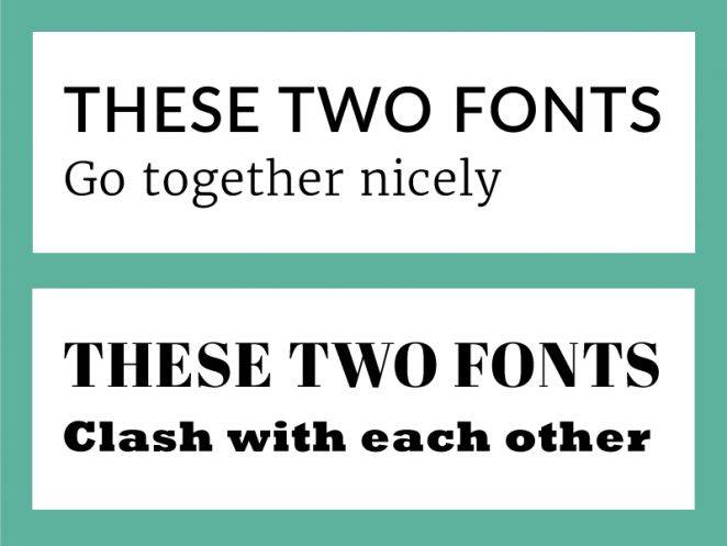
In addition to using too many fonts, care is taken to use coordinated fonts. The use of different styles of fonts naturally gives people a sense of "wrongness" and distracts users and reduces the effectiveness of information transmission. The combination of fonts is between science and art, which requires you to learn layout and font skills, and is supported by a part of the designer's intuition. Where consistency is emphasized, liners and non-linears should not be mixed; in places such as posters, covers, etc., where two or more types of fonts are needed, matching liners and non-linears is important. Read more about magazines, websites and magazine layouts。
10. Disregard of content

Selecting fonts and styles is important, but look at your project first. Fonts are emotional, fun, tight, romantic, random, modern, retrospective, etc. If fonts and designs don't match the content, you create a feeling of disconnection and alienation, which confuses the audience. The company reports are rigorous, not to use child-real or decorative fonts, and the daily normal fonts on the tension posters are naturally design errors。
11. Form overfunction
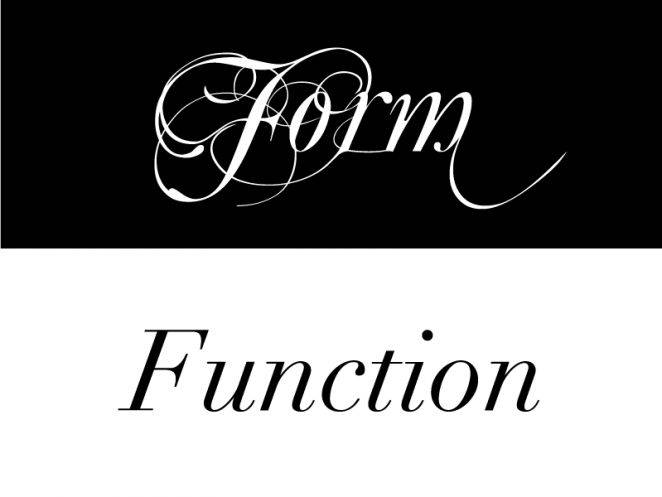
It's also an old saying. You can follow the design trends of recent years, find a unique font to design a cool and unique poster or banner, do very artistic work. But there may be reading barriers to such design, and it will take a long time for readers to distinguish its content, so that is the obvious form that is more functional than functional. If you decide to design it like this, it's better to balance art and readability -- that is, its functionality。
12. Overemphasis
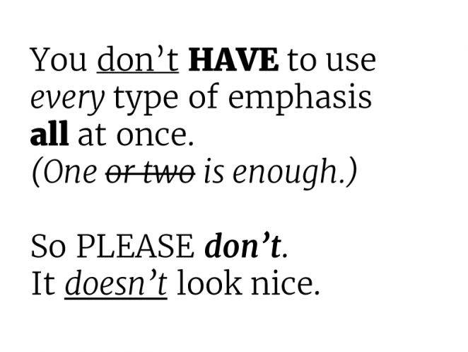
Sometimes you need to strengthen a part of it, and you need to focus on it visually, and get it out of the design. The text parts are common in many ways, in italics, bold, underlined, upper case, font size, etc. But it is important not to use all the emphasis in the same paragraph in the same text, which would make it look messy。
13. All in capital letters
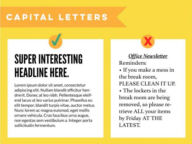
Similarly, it is a common design error in english. In the title, all capital letters are used, which is no problem, and in the paragraph, where there is an occasional need for emphasis, capital letters are used. Until then, however, the most basic usage habits that have been agreed upon are capital and lower in the main text。
Ignoring hierarchy
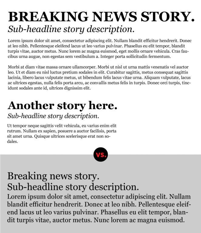
In layout, the term hierarchy is an academic term that distinguishes between the importance of the text and the different elements. In the case of the newspapers that we know well, the title describes the core, the largest size, uppercase text, bold emphasis, followed by subheadings, small fonts, no uppercase text, and then the main text, the smallest font. If this hierarchical structure is broken, users are puzzled. I don't know what's important。
15, no
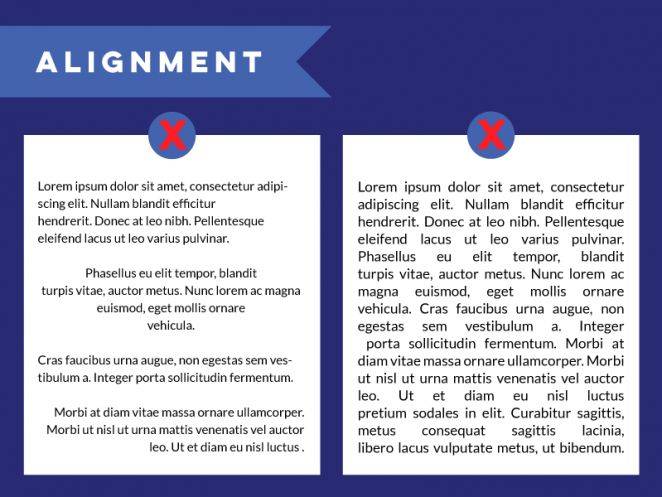
Alignment is one of the most important of the design principles. Alignment will allow the text to be organized in an orderly and rational manner and to be visually uniform and consistent. The combination of different alignments creates random space, difficult to read and difficult。
16. Use alignment tools
The best way to get the layout aligned is to open the software alignment tool, which now has relevant alignment aids, which will help to make your layout more coherent。
17, rough edges
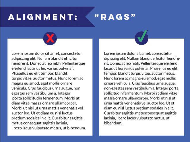
This problem is more common in english layouts, which are actually less serious in chinese layouts, where tools such as office automatically fine-tune you, and more specialized layout software with the corresponding algorithms. The english version is more problematic and requires your careful treatment of adjustments, which is not a particularly complex matter, but rather one that is important。
18. Add special effects
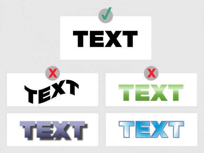
It is a good idea to add special effects in general, but it must be used in the right way. Many self-carried font effects, such as 3d fonts, big shadows, distorted effects, can easily make the design look cheap and too fancy. Read more of the fashionable design paradigms and restrain the urge to add special effects at will。
19. Test new effects in important projects
Testing new design techniques, special effects and interesting fonts in important projects is not a scalable solution, nor is it an appropriate time, or even a professional designer. Such an approach would be too risky, because the new technique would most likely not be practical and reliable, and if you believe that your instincts should also be tested in other non-important projects。
20. Forget the audit
Design needs to be strictly closed, and it is irresponsible to do so without review. Upon completion of the design, it is advisable to read the full text and spell-check to ensure that there are no grammatical errors and printing errors, which are also part of the design。
Retro poster series
Nice and daring poster, old-timer tutorial
"ai academy! Illustrator for you to design a beautiful, wild, retrograde poster."
A retro-poster course for a simple atmosphere
The ps academy! The back-to-the-face poster that taught you to create geometry
A retro-poster's tutorial for starters
"newman's academy! Teach you to make a retrograde planetary landscape poster using ps."