# on the headline, hotter #

July 8 is the national insurance public awareness day. In an era when insurance requires the proper name of the state, the day is a carnival of sole insurers and has even become a traditional holiday of insurance。
I'm particularly concerned about this day because every year i write a relevant inventory article. The national insurance public awareness day is a hundred encyclopaedias, and i made the theme poster for 2013。
I thought that, as the insurance industry matured, the quality of the annual poster on the subject of insurance should be better every year than every year, even at the beginning of the year, with the 78 posters expected this year。
But i was disappointed when the poster and theme of the 2025 insurance public awareness day was published. This year's poster, the worst edition in years, is ugly and embarrassing。

The subject of previous annual insurance is linked to the direction of the insurance industry and to events. For example, in 2015 the insurance industry upgraded the paper-based coverage to a simpler electronicization, the theme of which is "one-key insurance, care for unlimited " 。
In 2017, 2018 and 2019, for example, insurance was interpreted from the perspective of poverty alleviation, wealth preservation and home country, with the following themes: " get away from poverty, starting with a guarantee " , " protect the good, starting with a guarantee " , and " patriotize the family, starting with a guarantee " 。
The theme poster for 2020 was also more appropriate, combining the anti-prevalence elements at the time, the annual theme being "systems, we together" and the important role of insurance during the epidemic。
In addition to the new theme for the year 2025: love and responsibility, insurance makes life a better place... The slogan is very perfunctory, giving people a sense of "new bottled old wine." the two broadest-spread insurance slogans were simply stitched and then disappeared。
Let's just say, 2024-2025, can't we get together? The insurance industry is in a historic transition, with a large number of disengaged workers, and companies are beginning to advocate for excellence, integration, graded examinations, independent agents... Which is not the subject
Love and responsibility, insurance makes life better... Don't say customers, even insurance marketers are tired of both. Can't you get something new
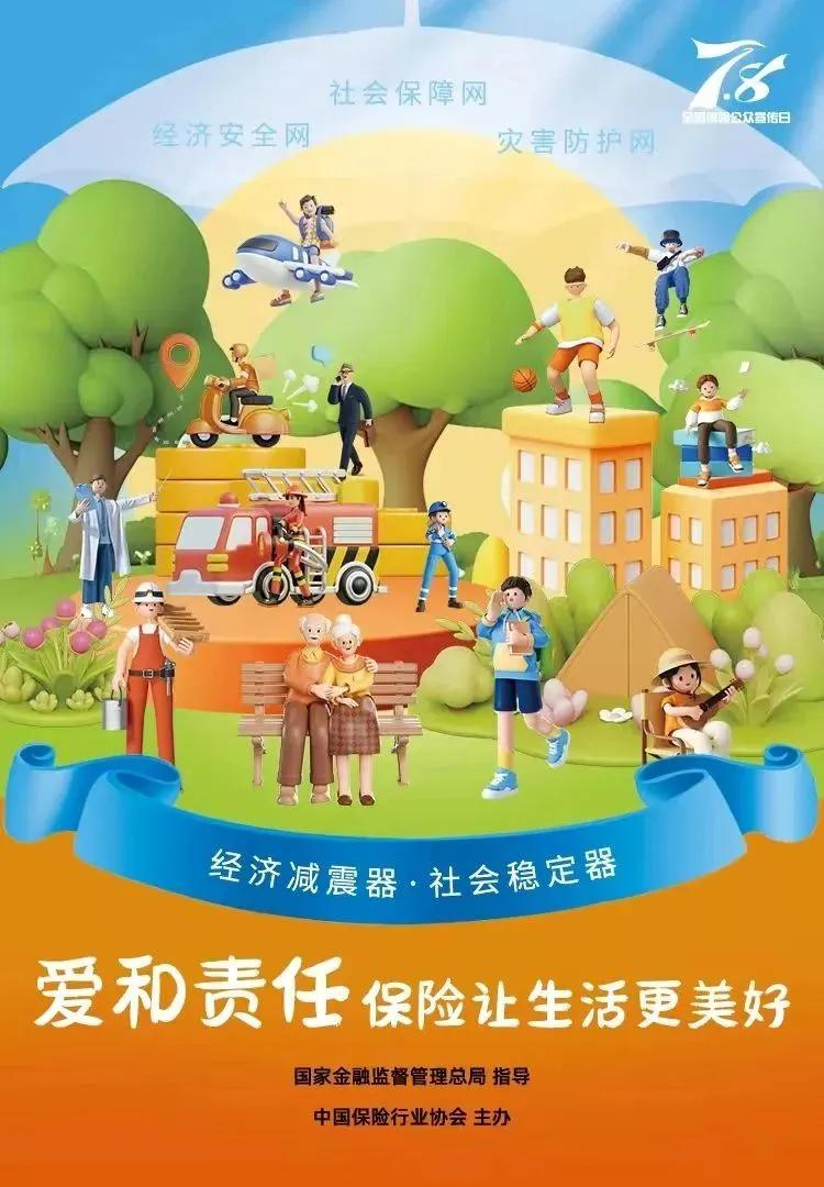
The first poster. Paper cutting style, multilayered scenery is in the shape of a shield, with curtains above the shield, and love under the shield. In the middle are buildings, trees, birds, wind power, multiple character clippings...
Look carefully, the characters are on a line, too concentrated. I'm afraid the cyclist bumped down the kid with the balloon and then the baby who threw the baby down.
But the poster wanted to send a warning that something like death was coming, and i didn't understand it. There's a big-head robot behind the character line, and it's more like it's going wrong。
Even more desperate is the quality of the poster in the back。
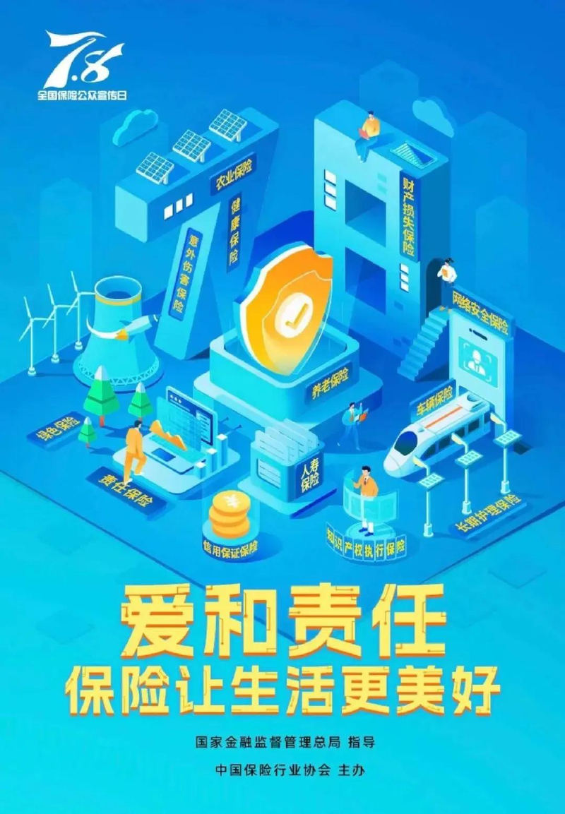
This poster, which is intended to be "five big articles" on insurance and finance, uses a whole new 2. 5-d design style, each of which is a small stand-alone scene, but the poster was designed with no power。
It's like downloading five 2. 5 scenes of graphic material online, and then it's over in one piece. No beauty, no design, no metaphors, no symbols。
What is inclusive finance for most people anyway? What's the difference between digital finance and science and technology finance? I don't think the odds are clear。
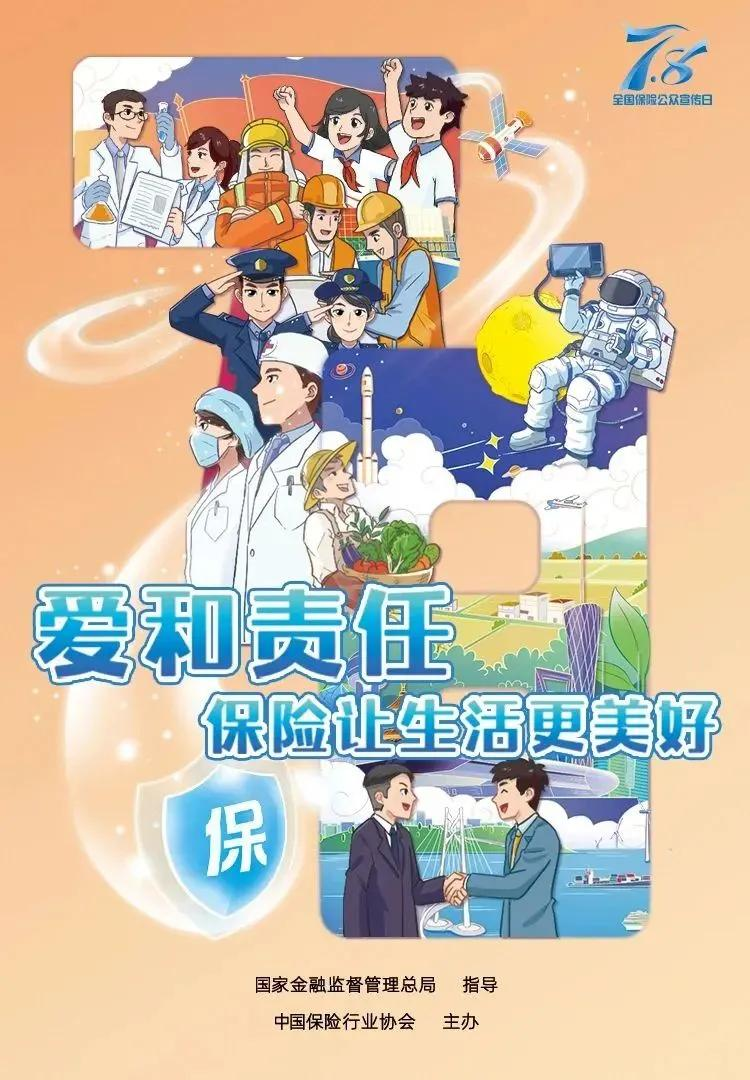
This one is 3d, and it's the most shocking. First of all, it's the text, and i'm afraid you can't understand what the poster means, and you're just writing out the dual functions of the economic shocker, the social stabilizer。
The official description is of micro-cities, which bring together people from all walks of life to demonstrate the harmonious coexistence of society. Where's the harmony? All i see is fear and uncertainty, okay
Three little boys died crazy on the roof, one playing basketball, one skateboarding, the other doing nothing. There's someone on a plane. It's real. It's on a plane.
The delivery boy drove the car to the house, and the car ran out of air and was sucked in by the man in the suit who came back. The fireman pointed the hose at the doctor who was reading...
It's more messy than my dream. There's a lot more order in kindergarten sketches。
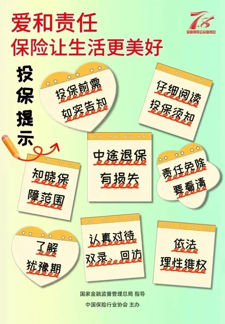
The poster was a good idea and a reminder of a few things to be noticed when buying insurance. But it's still frowning。
Gradual background poster, between light yellow and light green. The insuring tips are divided into three different shapes: square, heart and rounded five stars. It's probably to highlight the importance of red waves in every line。
Not dude, you know, when all words are focused, it means there's no focus. It's a policy advice. It's for insurance, but the bottom right corner is making people legally rational。
Were you scared of two years of clients giving up full security
The poster continues to follow the 2. 5d style of love and responsibility, with a bit of a mechanical feeling. Looking back, it's a puzzling design, and i can't look at it。
There's no one on life insurance? A huge shield in the middle of pension insurance? There's a guy sitting on the roof with a laptop? But what does this have to do with property insurance? The laptop falls downstairs and it's broken
Cyber-security insurance is closely linked to vehicle insurance, which is an area where cyber-fraud is a serious problem? On the left side, a missile was fired from a power station, a show of my major heavyweight, or a bomb attack on pension insurance
Last one. Forget it, i don't want to say anything. It's a brush style. Kids should like it. And there's no deep meaning in it, but there's a lot of material in the 7 and 8 framework。
But if you set up a member in a founding sticker or a copy, it's a fine poster for you. If you don't want to spend money, you can use it like a dream, and if you're looking for beauty, the posters that you're designing are absolutely amazing。
I announce that i will not write about the insurance public awareness day this year. I can't exaggerate that these designs are so ugly that they challenge my aesthetics。
As for this year's insurance slogan, even if it is not an annual theme, i say these two words every day. Let's just forget about it. I won't promote it anyway。
When you think about it, you understand:
Insurance workers were close to 10 million at most, and when the economic situation was good, insurance needed the country's proper name, which everyone cared about. The poster must have been designed with a heart, and it's a good thing you're forwarding it together。
Now there are less than 2 million people in the entire insurance industry, and many of the practitioners can't even afford to eat, are hungry enough to move to take delivery, and who cares about the beauty of a poster。
I'm not going to advertise this year, so let's go。
Today's topic
What do you think of this year's poster