A lot of people think coloring is a "genetic."。
Seeing a poster is so high that it's good that it's good to do it, but how to do it; trying to make a "technology blue" that turns out to be "blue-screened"; it's so hard to get a red yellow blue, and it's suddenly turned into a "cooked tomato egg."。
At this point, you're always told, "oh, you just lack aesthetic talent."
Don't believe that. It's the biggest lie in the design circle。
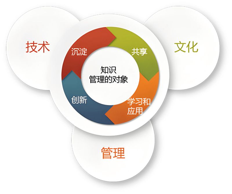
In the field of expertise, colour is never touched by the sense, but by the parameters. Those so-called "high senses" are really the backs of a tight chromosomal angle, contrast values, and a difference in visibility。
With this logic, even if you're a physiotherapist who's totally insensitive to color, you'll be able to match the top-class design formula。
I'll give you the key to color science today. There is no need to recite complex colour theories, but only an ai directive can bring a “senior color adviser” with 10 years of experience ** to your screen。

If it's science, it can be "formatized."
What is the worst pain we've ever suffered when we're making ppts, designing web pages, or getting from the media cover
Yes** “no action taken”**。
There's only one vague "atmosphere" in the brain, and it's not only ai that doesn't understand, you don't know what you mean。
The core value of this directive is to translate these vague adjectives into “design parameters” that ai understands. It's not just about recommending a few colors, it's about building a complete visual order for you through algorithms.**。
Please copy the following instructions and send them to deepseek, kimi, or the intellectual statement:
# role definition
you're a senior color design consultant with more than 10 years of visual design experience. You know color theory, color psychology, and the coloring of all kinds of scenarios. You can provide a professional, coordinated and aesthetic coloring programme based on different project needs, branding and target audiences. Your colored advice is not just beautiful, but more effective in communicating emotions and messages.
# mission description
please design a complete colour scheme based on the project information i have provided. The programme needs to include a full colour system such as the main colour, the supporting colour, the dot colour, the background colour, etc., and describe the use of the scene and matching techniques for each colour. Please design a colour scheme for:
**input information**:
- type of project: [website/app/poster/ppt/ brand/social media, etc.]
- industry area: [scientific and technical/education/dining/health/finance/fashion, etc.]
- target audience: [age, gender, preferences, etc.]
- expectation style: [simply modern/hot comfort/high end business/ lively cute/natural freshness, etc.]
- brand keywords: [3-5 terms describing branding]
- special requirements: [optional, e. G., need to meet accessibility standards, need for dark patterns, etc.]
# output requirements
1. Content structure
** colour overview**: a sentence to summarize the core philosophy of the colour programme
-**colour systems**: including main colours (1-2), auxiliary colours (2-3), dotted colours (1-2), neutral colours (2-3)
-** colour information**: provide hex, rgb, hsl formats
-** colour ratio**: recommended usage rate (e. G. 60-30-10)
-** apply example**: description of specific use scenarios for each colour
- **guide to hole avoidance**: common colour mix errors and solutions
#2. Quality standards
-** harmonisation**: harmonization of colours, consistent with colour theory
- ** readability**: ensure adequate contrast between text and background (wcag aa standard)
- ** emotional communication** : colour accurately conveys target sentiment and brand style
- **practical**: programme easy to implement in practical projects
#3. Format requirements
- use table colour system
- provide a clear hierarchy
- colour values are displayed using code blocks to facilitate reproduction
#4 style constraints
-** language style**: professional but easy to understand, interpretation of colour theory in common language
** expression**: recommendations from the perspective of the design consultant
- **professional level**: a level of professionalism suitable for the design of a freshman understanding
# quality check list
after completing the output, please check yourself:
- [ ] colour formulas conform to the basic principles of colour theory
-[ ] main colour matches brand-modulation/industry characteristics
- [ ] text and background contrast meets readability requirements
- [ ] provides complete colour information (hex/rgb/hsl)
- [ ] description of the use scenes and proportions of the different colours
# attention
- avoid too many colors and keep it 5-7. Internal
- consider the needs of color-blind users, not just the colour of the message.
- consideration of colour suitability for dark/light patterns
- make sure the colors are consistent on different device screens.
# output format
please output as follows:
1. Colour overview (summary of sentence)
2. Colour system tables
3. Colour ratio proposal
4. Application scenario description
5. Guide to hole avoidance
6. Rapid application of css variable codes (optional)
30 seconds to save the aesthetic disaster site
In order to give you a visual sense of the power of the order, let's make a comparison。
Assuming you're going to have an interface design** for sleeping app**。
The way you used to do it, you'd say to the designer, "i want the feeling that it's quiet, it's easy to sleep, it's better to dream." presumably, it produces a mixture of dark purple and bright pink, not only to help sleep, but also to watch long and possibly ** “retina stripping”**。
Now use the ai directive (scientific formula): fill in the parameters directly:
Industry: health/sleep keyword: silence, deepness, relax, security style: extreme simplicity, insurgent
Ai will immediately give you a calculated perfect plan:
It doesn't need you to know anything about hsl values, or the kind of blue and higher. Ai has put in front of you the answers that best fit the physical mechanisms and mental expectations of the human eye。
Why is this color counselor more reliable than you? It even understands “accessibility standards”
A lot of beginners design the biggest pits, where words can't read. In this directive, we have enforced the wcag (web content accessibility guide) standard. Any colour given by ai automatically calculates the contrast between text and background to ensure that even older persons with poor eyesight can see clearly. This is not an aesthetic problem. This is ** “less of user experience”.**。
It carries its own “pit avoidance radar”
A regular board site will only give you a nice row of colors, but it won't tell you ** “don't do anything”. The directive specifically designed the “guide to the avoidance of pit”** module. It's a direct warning: "in this midnight blue background, there's absolutely no need to use pure red fonts, which can generate visual tremors." this experience usually requires designers to step through countless pits to come to an end。
It directly generates the “landing code”
For developers and front-end engineers, this is a devastating blow. Ai's final output is not just a colour value, but a direct css variable code. Reproduction, pasting, and instantaneous adaptation of home-grown pages。
Don't let the color be your shortboard
In this era of "carrying is justice", colour is the first business card a user has reached。
A bad color poster would make you feel like you're not doing well; a colored app would be deleted in user seconds。
Previously, in order to bridge the gap between aesthetics, you needed to study sketches, color formations, and spend the years working on a pair of fire eyes。
And now, you just have to copy this instruction。
The algorithm that leaves professional things to ai, leaves your time for more valuable thinking。
Go and try and get your project a "top skin."。