
In the practice of calligraphy, many people devote all their energy to writing in big words, grinding one picture over and over again, trying to be precise, verbish, and then finishing the work, leaving behind a name that seems to have done the work, destroying the whole word tone. A person who truly understands calligraphy and rewards it will never read only big words, and a drop is the face of a book called law and the key to highlighting the work of writers, aesthetics and etiquette. Even if big writings are a little childish, they can be a sign of the work, and the whole writing can be classic。
It is by no means a simple signature. It is an integral part of calligraphy, complementary to the body of the text and a first-hand response, which balances the rule of law with the refinement of the content and is a direct expression of the author's comprehensiveness. If you want to write a classic, durable drop, you don't need a complicated technique to hold on to the following six patterns, you can easily squeeze the essence of the money。
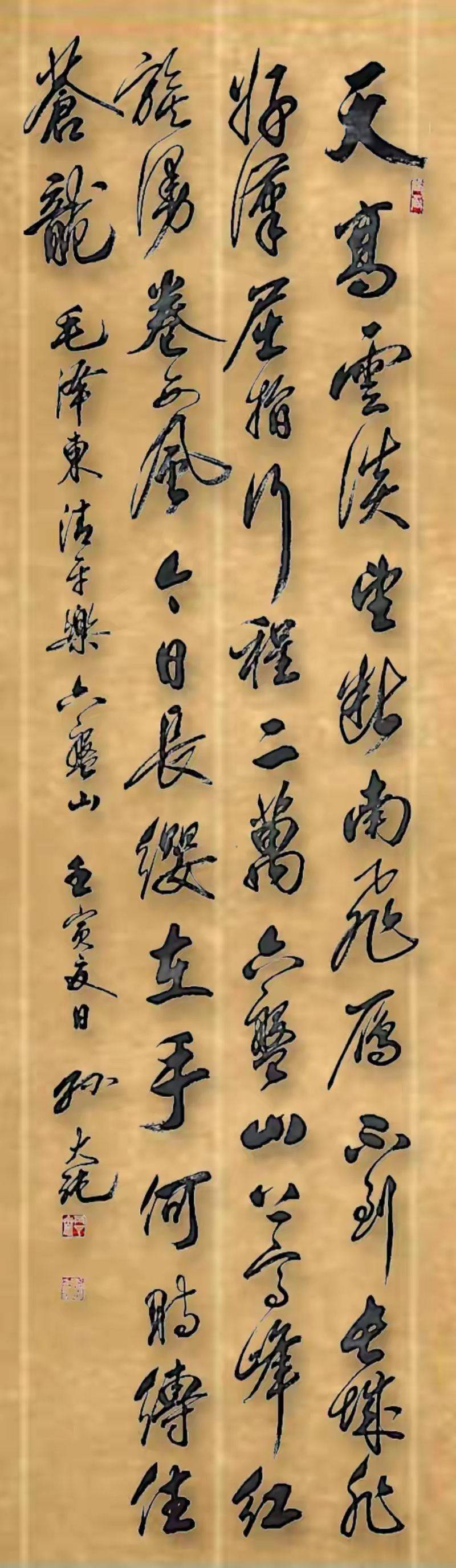
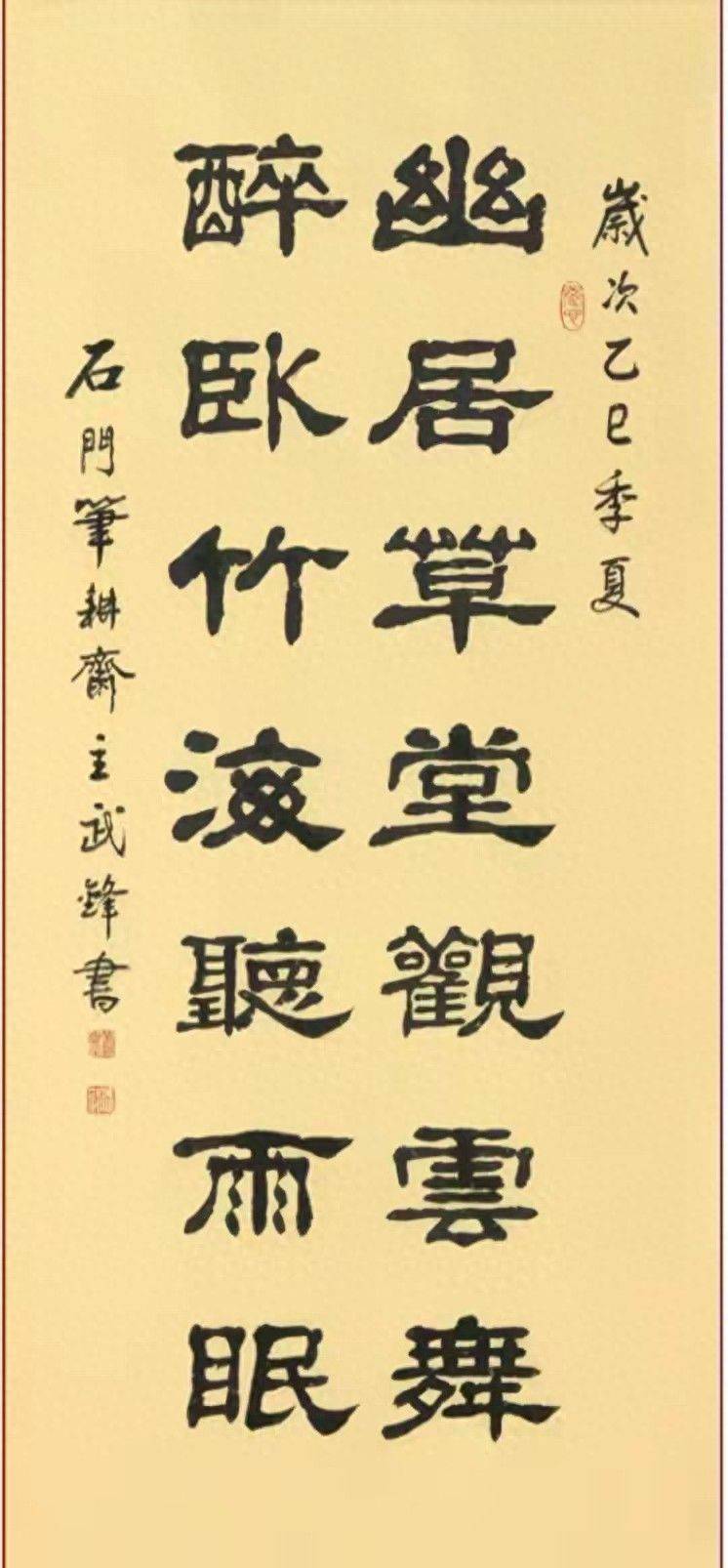
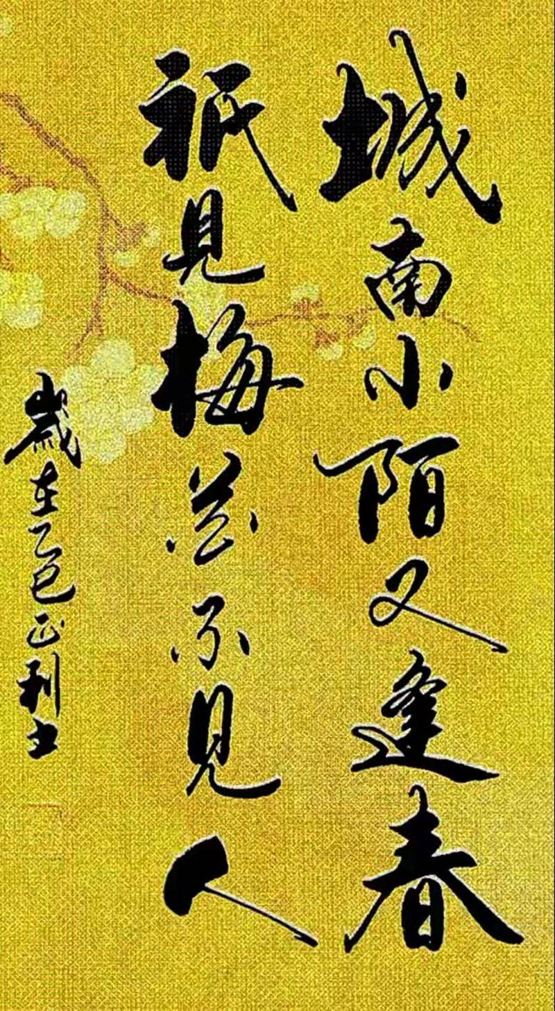
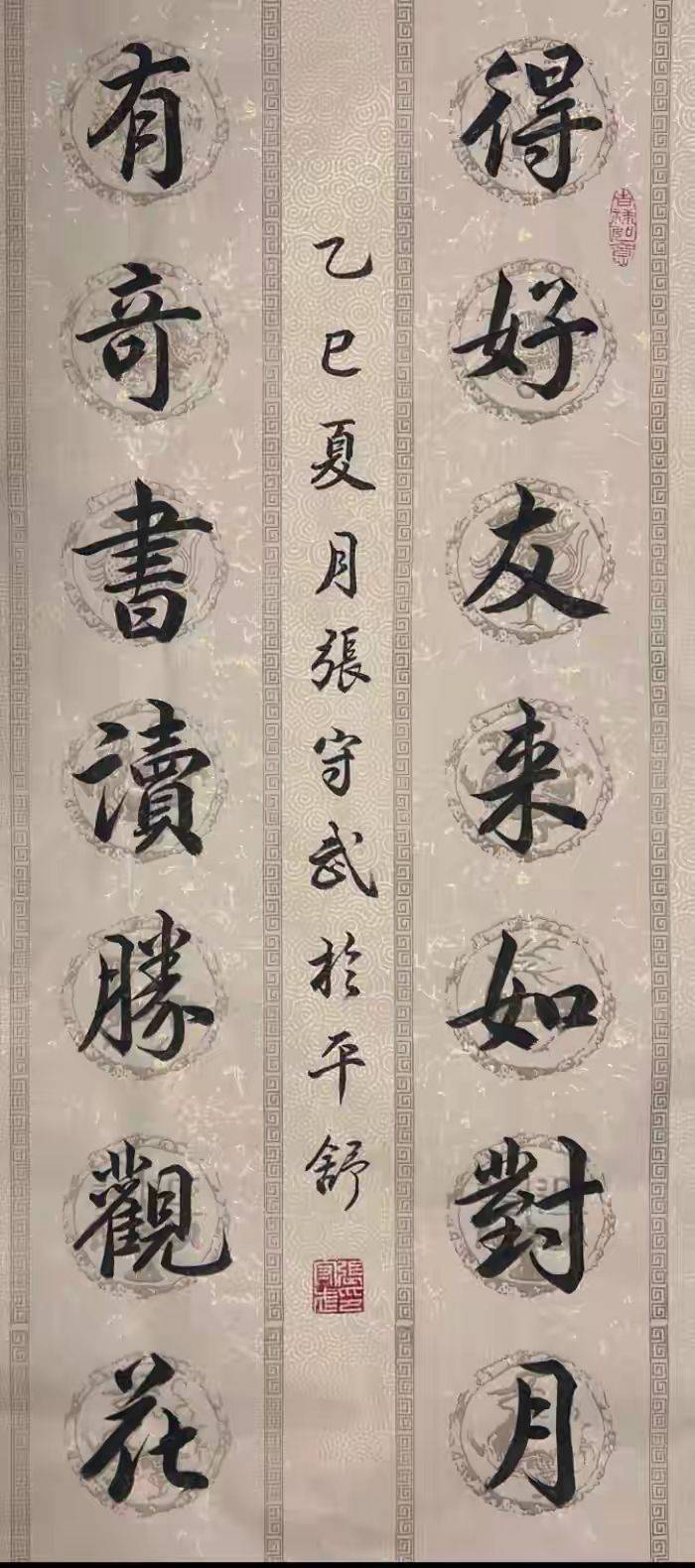
Rule number one: fit and small
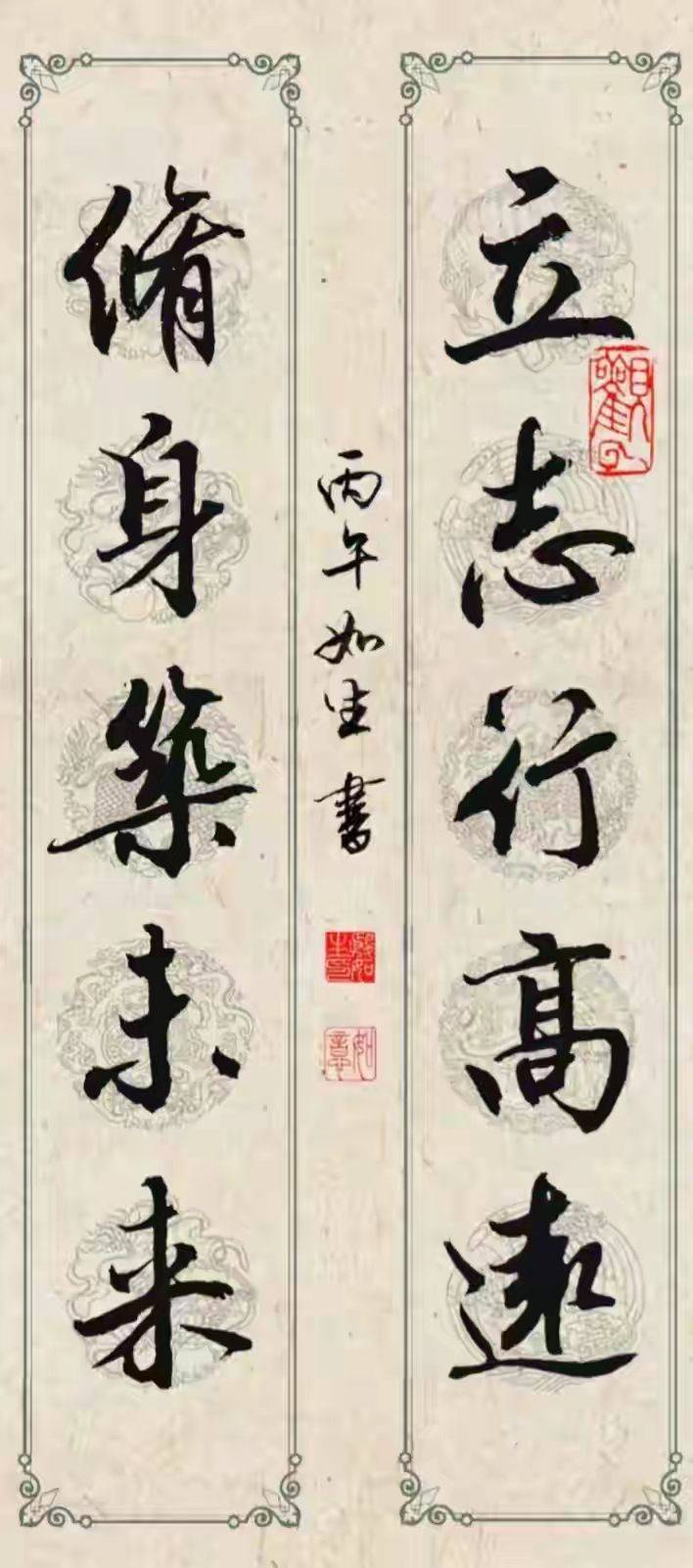
The font size of the down payment is the first principle to be followed. The central point is that the downword must be smaller than the original text, and that it must not be more expensive than the text, and that it should not prevail. The text is the subject of the work and is supplemented by the fact that, if the text is too big, it suddenly takes over the focus of the visual focus and leaves the work unbalanced, undermining the whole beauty and acting as an amateur. In general, small words are compared to the body of the text in an incoherent, large and small way, both to match the atmosphere of the text and to make the rules more sophisticated. Even in the case of books and books, the font size must be strictly controlled, which corresponds to the roughness and overall length of the text, so that it is clearly defined and erroneous。
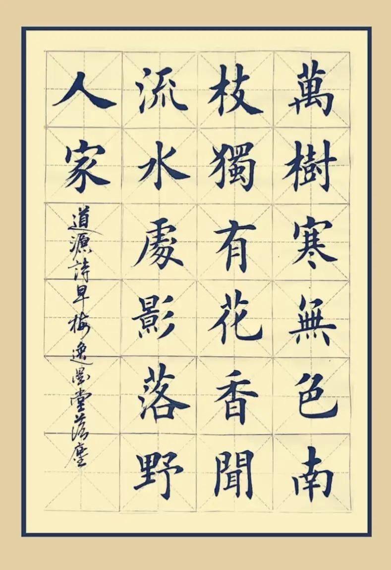
Second law: font coordination, ningu never existed
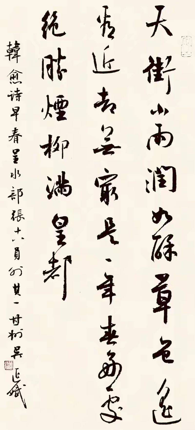
The drop font is to match the body of the text and follow the "synthetic, symmetrical" rule, and it's confusing. Usually, the proper words of a set of works, such as books, books, and role models, should be used as a guidebook or a role model, which is both moving and not too high; the text of a book, which can be used as a book or a weed; and the text of a grassbook, which can be used as a match to a weed, so as to maintain consistency. Remember not to be able to match the body of the body with the body of the body, nor to be an example, to break the whole rhyme of the work with grass. To keep the font style coordinated, the text and the down payment are made so that the rules and rhymes of calligraphy are shown。
The third rule is that it's in the right place
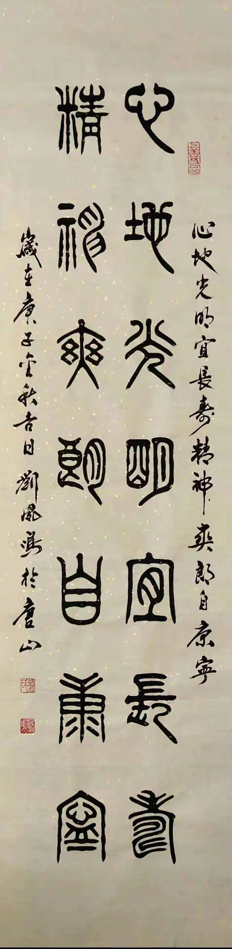
The location of the deposit directly affects the rules of the work and is subject to a flexible choice based on the length of the text and the font layout, the core of which is “no crowding, no white symmetry”. Most of the regular drops are on the left side of the work, divided into long, short, poor: the text is small, well-used, long, time, place, cause of writing; the text is full, limited, short, name added; space is so small that it is poor that it is given only by name. In any case, the text cannot be kept close to the text, leaving a proper gap or going beyond the frame of the work, let alone sealing it. Right drops need to be careful and fit only for a particular rule of law, with new hands giving priority to left drops and ensuring that rules are smooth and generous。
Law iv: complete content, clear hierarchy
Classic drop-out content has a fixed hierarchy and follows the order of “time + place + name (#) + respect” and can be streamlined, but logic cannot be confused. The basic deposit shall include the time of writing (on the agricultural calendar, e. G. For twilight spring), the name of the author, the place where the entry may be written, the reason for the creation, and the contribution of the work, e. G. “mr. Yazheng xx”. Content is formulated in a concise and elegant manner, without words, in a respectful manner and in such terms as “books, writings, bad pens, graces” and so on, so as to avoid inappropriate use of words. The content level is clear, improving both the information of the work and highlighting the cultural background of the author, making the drop more qualitative。
The fifth rule: the stamp goes with less and better
The seal is the end of the deposit and follows the pattern of “better than less, less than less, better than better, better than better”. It is not appropriate to have more than three seals in one piece, and it is sufficient to have a common name stamp plus two idle stamps, bearing in mind that it cannot be sealed together. The size of the stamp is smaller than the size of the drop-off font, which cannot be larger than the drop-off text, otherwise it would appear to be a lump-sum, while the name stamp is often accompanied by a combination of zhu and white, a yawn and a blank stamp. The seal shall be placed under the name of the deposit, with a gap between the deposit and the deposit, and the stamp shall not be stamped at will, and the seal shall be clear and smooth, so that it may be perfectly integrated with the deposit and the text。
The sixth rule: consistency, harmony
The writing and writing of the deposit must be consistent with the text, so that the first line of response is consistent, so that the text cannot be a sturdy style, but the money is soft. When writing a book, you have to continue the pen rhythm of the text, change the ink colour, even with a simple signature, and do everything you can to match the ink rhyme of the text. It is not an independent writing, it is a continuation of the writing, and it is only by being coherent that the whole work can be made, and even if it is of low quality, the tone of the book can be maintained。
The beauty of calligraphy is focused on the whole rule, and the down payment is the key to controlling the whole. A lot of people reword the text, make it easy to know that it's the "plus" in the eyes of the proprietor, the face and soul of the work. The six rules are so sophisticated and flexible that they don't have to worry about whether the big words are perfect, and the downfalls are so traditional, so that every one of them is complete, elegant and able to work。